
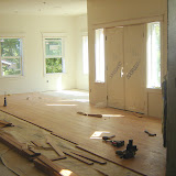
Dining room layout. The 2x12's on the floor are to show the basic layout & also simulate the depth of the built-ins. We'll place columns at the corners of the space to help define it. Short cross-pieces are there to help us figure out where the half walls stop to create the walkthroughs. I think we'll lengthen the walls a bit from what this pic shows.

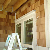
Another change in the Master Bath. Curtis (behind the ladder) indicates where we want this wall cut down. Basically we are flipping the shower 180-degrees, in order to open the back of it up. Without the wall height, we'll have a more open feel and the window to the left won't be blocked. The shower heads will be situated at the stub wall in the foreground instead.


1 comment:
Post a Comment